"FRAME's design director Barbara Iwanicka reflects on the beauty of connecting over stories and how it inspired the design of our 2024 Special Issue.
Today, I tuned in to the latest episode of my beloved podcast, Heavyweight, hosted by Jonathan Goldstein. In a surprising turn of events, he revealed that the show – a constant in my life for the past seven years – would be concluding in its familiar form. The announcement hit me like the loss of a dear friend. Since the pandemic introduced the work-from-home era, podcasts have been my go-to companions. In the absence of office chatter, the creators have been the voices filling the void, sharing the most incredible stories, and accompanying me on a journey of learning, wonder, laughter, and sometimes even tears. Escaping into their world of spoken magic became a regular refuge, leading me to revisit countless episodes and still wonder: why does it matter so much?
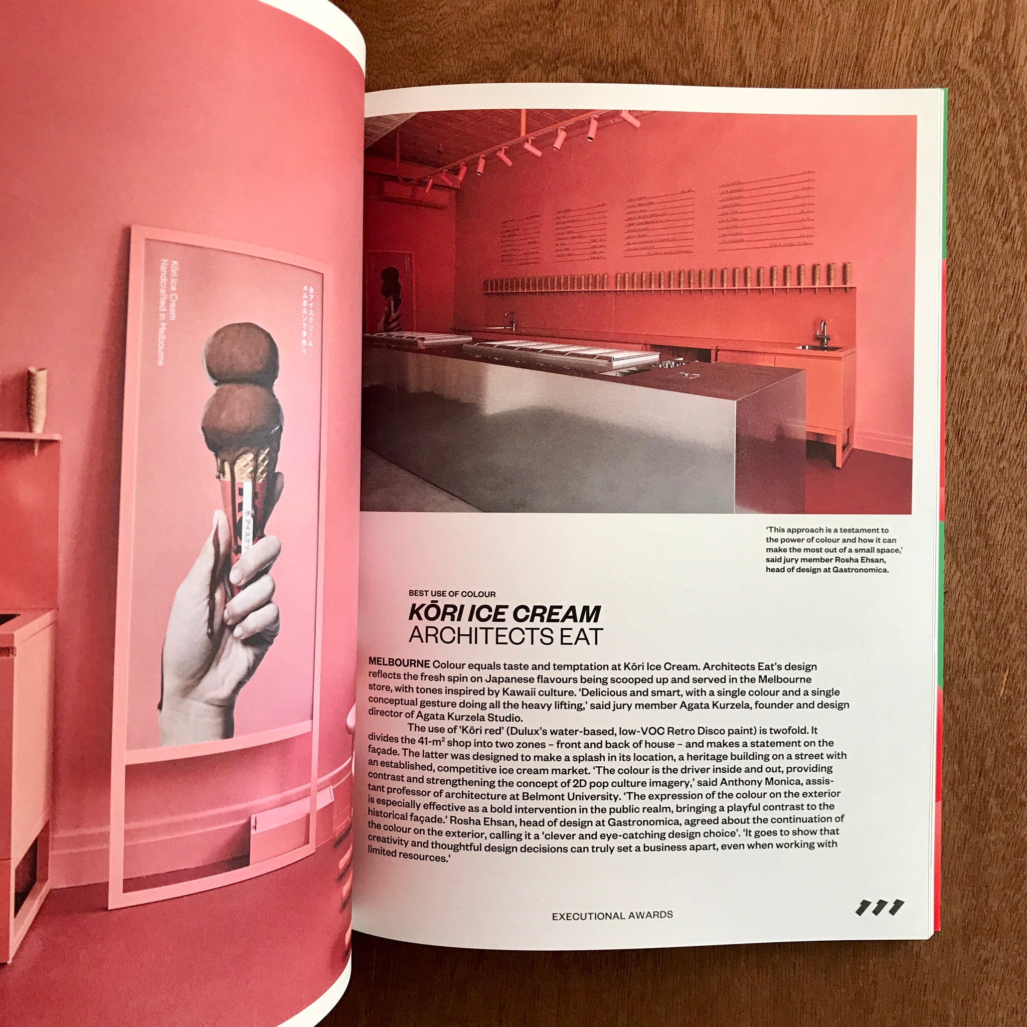
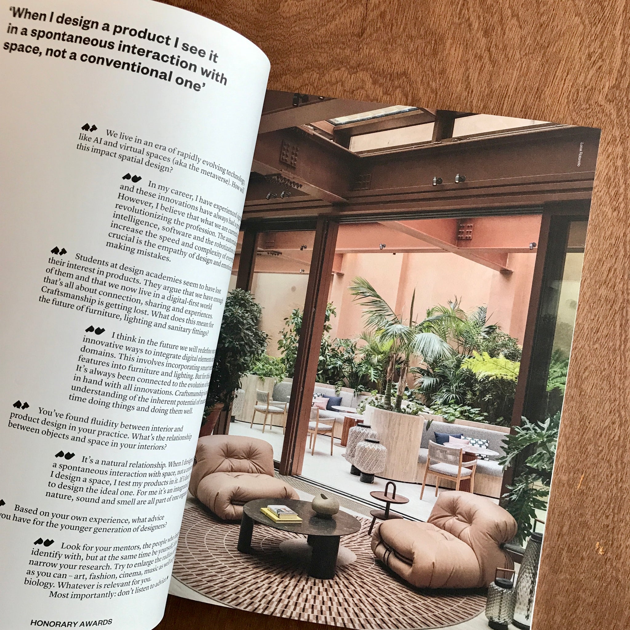
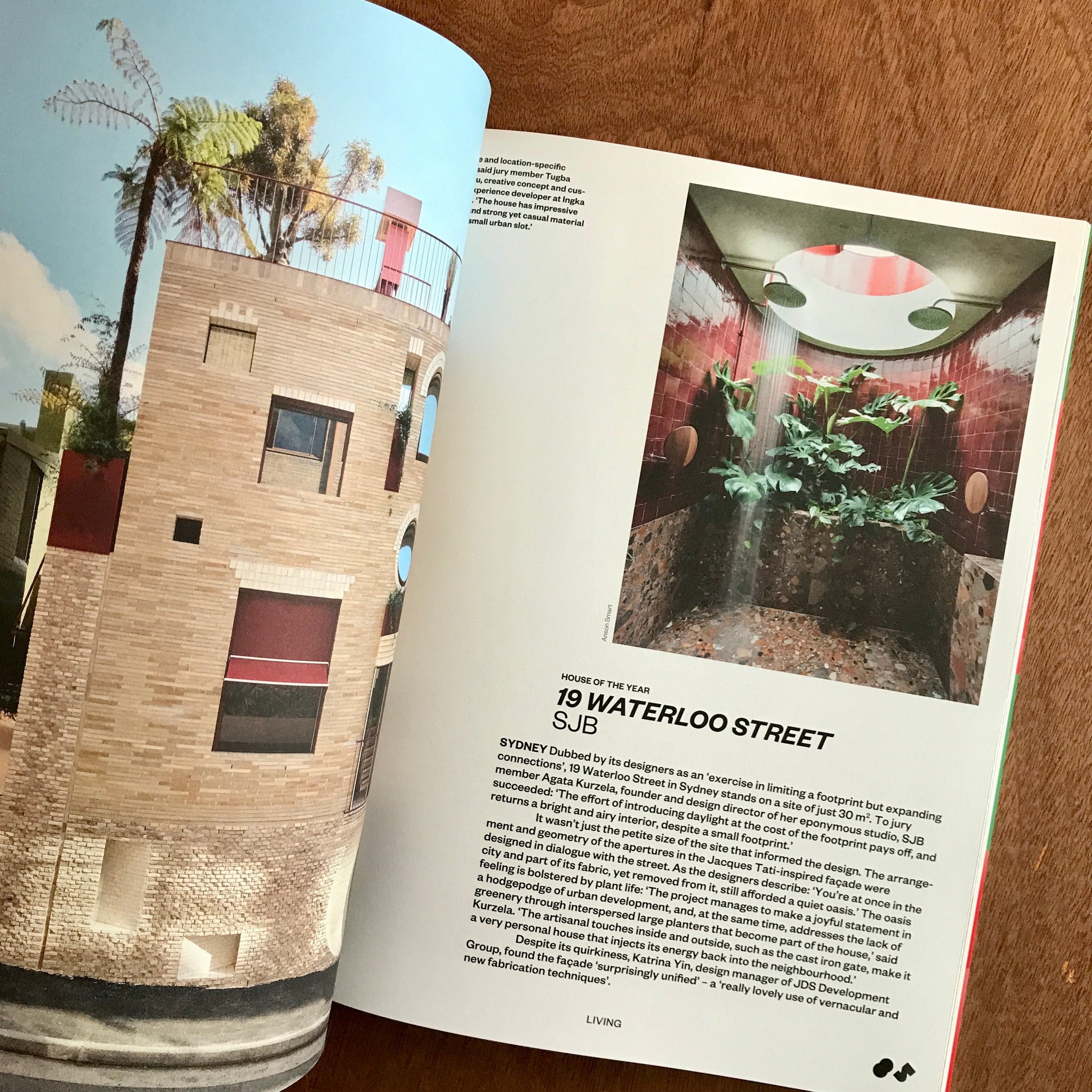
Connecting with others is a fundamental human condition. Our ability to communicate, empathize and form relationships is essential for our emotional wellbeing and social development. From sharing experiences and ideas to offering support and fellowship, the connections we make with others enrich our lives in countless ways. And the latest issue of FRAME is proof of just that. This special issue showcases the winners of FRAME Awards 2023 – the projects and people representing the best of the spatial design industry in the past year. Additionally, it features insights and reflections from members of the jury, contextualizing the projects based on their professional and personal experiences.
To accompany the innovative spaces showcased, we have chosen to incorporate an additional typeface – the geometric and robust 40 Degrees by Selma Losch. When used in black, this typeface emanates a sense of organization, defined by fundamental geometric forms. Placing it prominently on a coloured background for the chapter opening spreads conveys a sense of authority and clarity. However, delving into the mosaic-like options of this versatile typeface creates a distinct atmosphere that harmonizes seamlessly with the featured interiors. Positioning these variations alongside images on a white background evokes a similar mindset to that of the projects, echoing their materialism, texture, and colours."